geom_errorline for intervals
I’m back! This post is about my attempt to create a ggplot2 geom, which I’m calling geom_errorline. You can use geom_errorline as part of my econothemes package. I’m still a noob when it comes to the package-making game, so definitely let me know if there are issues or you have questions. You can install the package from Github with the code below.
devtools::install_github("weiyangtham/econothemes")library(tidyverse)
library(econothemes)
theme_set(theme_nber(base_size = 18))What does geom_errorline do?
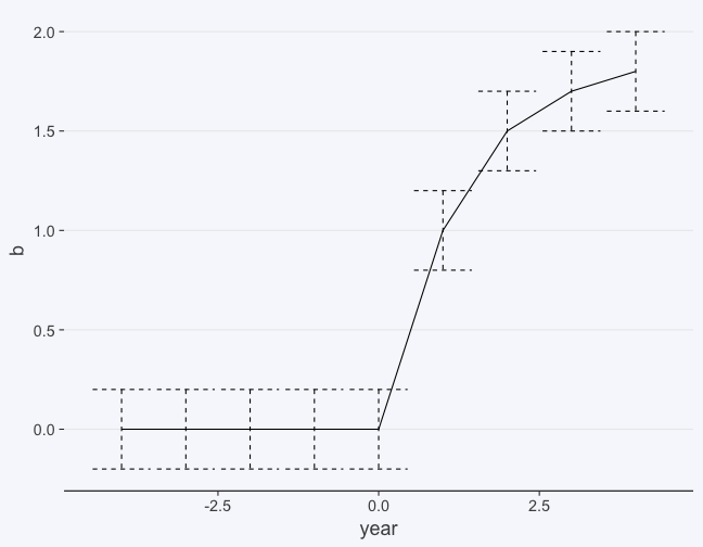
There are many circumstances where you want to plot a line and also show some intervals around the line, such as confidence intervals. In economics you’ll see this most often in an event study or difference-in-differences, where you have coefficients for each time period before and after a treatment date. There are a number of ways to do this. For example, you can have an error bar for each coefficient.
df = data_frame(b = c(0, 0, 0, 0, 0, 1, 1.5, 1.7, 1.8),
           year = -4:4)

p = ggplot(df, aes(year, b, ymax = b + 0.2, ymin = b - 0.2)) + geom_line()

p + geom_errorbar(linetype = 2) 
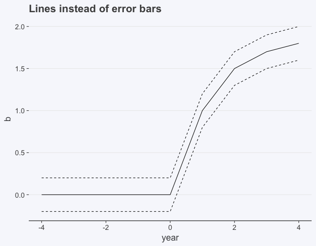
Another way you could represent this is to give the upper bounds and lower bounds as their own lines. You could do this by adding a separate geom_line for the upper and lower bounds respectively.
p +
  geom_line(aes(y = b + 0.2), linetype = 2) +
  geom_line(aes(y = b - 0.2), linetype = 2) +
  ggtitle("Lines instead of error bars")
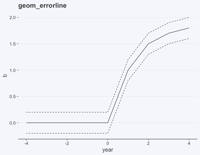
geom_errorline does the same thing as the code above. It saves you a bit of typing and I think also makes the code more readable.
p + geom_errorline(linetype = 2) + ggtitle("geom_errorline")
If that’s all you came for and you just want to use the geom, you can stop reading here. The rest of the post is notes on the (semi-painful) process of creating a new geom.
The process
The first thing I realized was that creating a new geom wasn’t going to be as simple as writing a wrapper around geom_line, or at least not the way I tried it. I came across this post much later about combining multiple ggplot2 layers, but a new geom is still appealing just because it remains consistent with the other ggplot2 code you’re writing.
If you’re interested in writing an extension to ggplot2, you’ll probably want to start with this vignette. Some of what I’ll write below is a dumbed-down version of material from that vignette.
It turns out that creating a new geom from scratch is actually pretty involved because you have to know grid. Thankfully geom_errorline is essentially an extension of geom_line, so technically speaking I didn’t have to learn grid. Still, I’d never actually tried to figure out how geoms work, so it took me a while to even realize that learning grid from scratch was probably not an efficient use of my time.
Every geom essentially has a ggproto object. So geom_line has GeomLine, geom_point has GeomPoint. Most of the action is really taking place in writing the ggproto object. Since geom_errorline is essentially a combination of geom_line and geom_errorbar, the rest of the process was essentially trawling the ggplot2 Github page for code from those 2 geoms.
The tricky part was “converting” the GeomErrorbar code to plot two lines rather than multiple intervals. Without going into too much detail, the basic idea is that GeomErrorbar makes use of GeomPath$draw_panel to draw the interval lines. Each interval has 3 lines: 2 horizontal lines denoting the upper and lower bounds, and one vertical line spanning the interval. So the data that is being fed into ggplot2 has to be arranged so that
- there are coordinates for each of those lines and
- the coordinates have to be assigned so that each error bar belongs to a different group, so that you don’t draw lines connecting coordinates for separate intervals.
Similarly, the data for GeomErrorline had to be arranged so that you have the coordinates for the upper bound in one group and those for the lower bound in another group.
What’s left
One of my main concerns is that I’ve used tidyverse functions within GeomErrorline and I probably haven’t followed best practices in that regard, so I’ll try to address that soon. The package itself has a lot of rough edges that need work. Other than that, if you find something or have suggestions, do let me know!
Leave a Comment