Making a ggplot theme
Recently I created a simple custom theme, inspired by the NBER’s plots for its magazines. Here are some notes on how I did this. I hope it’ll be helpful for someone who wants to have greater control over their plots.
Big picture
There are two things that go into the theme.
-
The theme itself. Normally this is a function with a name like
theme_Xe.g.theme_minimalin the ggplot2 package, ortheme_fivethiryeightfrom the ggthemes package. -
A custom color palette (this is optional).
theme_fivethirtyeighthas a custom color palette which you can use with, for example,scale_color_fivethirtyeight.
theme_nber()
This is going to sound obvious, but building a custom theme (at least for my case) is essentially a matter of taking an existing theme, knocking out the elements you don’t want and putting in the new features you do want. So how does this actually work?
In my case, I started out with the ggplot2 default theme_grey. Another option is ggtheme’s theme_foundation(), which I didn’t learn about till much later. According its documentation,
It is easier to create new themes by extending this one rather than theme_gray or theme_bw, because those themes those themes define elements deep in the hierarchy.
Which you use probably depends on how much flexibility you want to have in creating your theme. If you’re only changing one or two features then starting from scratch might not be worth it.
Removing gridlines
Let’s look at a side-by-side of theme_grey and theme_nber.
library(tidyverse)
library(econothemes)

p_grey = ggplot(mtcars, aes(mpg, wt)) +
  geom_point() +
  labs(x="Fuel efficiency (mpg)", y="Weight (tons)",
       title="Seminal ggplot2 scatterplot example",
       subtitle="A plot that is only useful for demonstration purposes",
       caption="Same example as in hrbrthemes") +
  theme_grey()

p_nber = ggplot(mtcars, aes(mpg, wt)) +
  geom_point() +
  labs(x="Fuel efficiency (mpg)", y="Weight (tons)",
       title="Seminal ggplot2 scatterplot example",
       subtitle="A plot that is only useful for demonstration purposes",
       caption="Same example as in hrbrthemes") +
  theme_nber()

# install.packages("gridExtra")
gridExtra::grid.arrange(p_grey, p_nber, nrow = 1)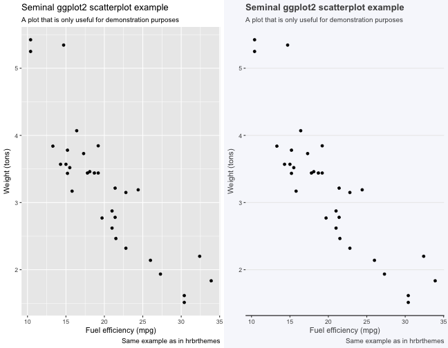
One of the major differences between theme_grey and theme_nber is the sparing use of gridlines in the latter. You can achieve that effect as follows:
theme_nogrid = function(base_size = 18, base_family = ""){
  theme_grey(base_size = base_size, base_family = base_family) %+replace%
    theme(
      panel.grid.minor.y = element_blank(),
      panel.grid.major.x = element_blank(),
      panel.grid.minor.x = element_blank())
}

p_grey + theme_nogrid()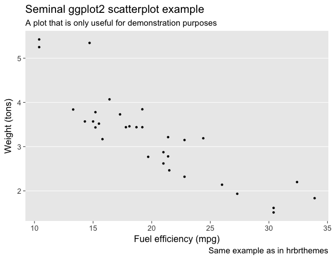
Ta-da! Notice that there are two types of gridlines - major and minor. I’d never have known that if I hadn’t embarked on this project.
Uniform background
Another obvious difference is that the background of the graph and the entire image are the same for theme_nber.
theme_allgrey = function(base_size = 18, base_family = ""){
  theme_grey(base_size = base_size, base_family = base_family) %+replace%
    theme(
      rect = element_rect(fill = "grey92", colour = "grey92", size = 0.5, linetype = 1)
      )
}

p_grey + theme_allgrey()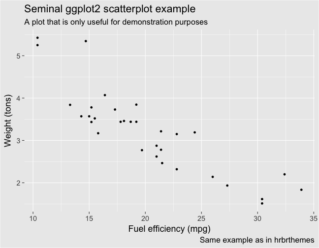
Change the fill and colour arguments to see how they affect the image. For theme_nber, I just replaced grey92 with the hexadecimal code for the NBER’s plots, using this website to figure out the hex code. My actual code is clunkier than the one above and I’m not sure why, so I will have to revisit that at some point.
There are a few other minor differences between the two themes, but I think these are the ones that really matter.
Palette
An interesting thing about the NBER’s plots is that they use different shades of blue (i.e. a sequential palette) to distinguish between groups (see below). 
This is probably OK if you only have 2 or 3 groups to separate out, but otherwise they become difficult to distinguish. I ended up creating a “palette” of two shades of blue, which means it won’t work if your data has more than two groups. For example, this is fine:
gapminder %>%
  filter(country %in% c("United States", "United Kingdom")) %>%
  ggplot(aes(year, lifeExp, color = country)) +
  geom_line(size = 1) +
  theme_nber(base_size = 18) +
  scale_color_nber()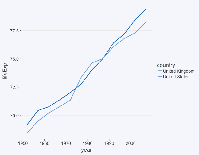
But this gets you an error message.
gapminder %>%
  filter(country %in% c("United States", "United Kingdom", "Singapore")) %>%
  ggplot(aes(year, lifeExp, color = country)) +
  geom_line(size = 1) +
  theme_nber(base_size = 18) +
  scale_color_nber()
## Warning: This manual palette can handle a maximum of 2 values. You have
## supplied 3.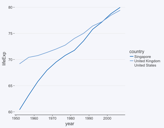
Coding up the palette was a challenge and in the end I just ended up copying Bob Rudis’s code for his hrbrthemes package. But I have to be honest and say that I don’t have a great grip on the ins and outs of it.
If you want to learn more about palettes, check out colorbrewer2.org
Go forth and theme
So that’s it! You could get even deeper into the weeds by, say, playing with the fonts. But if you just want to tweak your plots, the most important thing is to map the arguments in theme to the feature you’re interested in, and that just takes a little bit of trial and error or judicious googling. After that, it will be (mostly) easy-peasy.
Leave a Comment