theme_nber(): first pass
I remember someone tweeted recently that a nice way to get into making R packages is to make your first package a customized ggplot theme. Last night I made a first pass at creating a theme based on the NBER’s graphs in its research summaries.
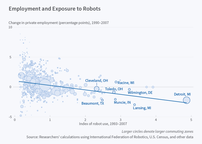
Here’s a typical NBER graph from the May 2017 NBER digest. The rest of this post is basically a reverse engineering exercise in trying to replicate the design of that graph. 
First, I wanted to try to understand what even goes into making a theme in the first place. You can do this by typing theme_grey, the default ggplot theme, in the console.
theme_grey## function (base_size = 11, base_family = "")
## {
## half_line <- base_size/2
## theme(line = element_line(colour = "black", size = 0.5, linetype = 1,
## lineend = "butt"), rect = element_rect(fill = "white",
## colour = "black", size = 0.5, linetype = 1), text = element_text(family = base_family,
## face = "plain", colour = "black", size = base_size, lineheight = 0.9,
## hjust = 0.5, vjust = 0.5, angle = 0, margin = margin(),
## debug = FALSE), axis.line = element_blank(), axis.line.x = NULL,
## axis.line.y = NULL, axis.text = element_text(size = rel(0.8),
## colour = "grey30"), axis.text.x = element_text(margin = margin(t = 0.8 *
## half_line/2), vjust = 1), axis.text.x.top = element_text(margin = margin(b = 0.8 *
## half_line/2), vjust = 0), axis.text.y = element_text(margin = margin(r = 0.8 *
## half_line/2), hjust = 1), axis.text.y.right = element_text(margin = margin(l = 0.8 *
## half_line/2), hjust = 0), axis.ticks = element_line(colour = "grey20"),
## axis.ticks.length = unit(half_line/2, "pt"), axis.title.x = element_text(margin = margin(t = half_line),
## vjust = 1), axis.title.x.top = element_text(margin = margin(b = half_line),
## vjust = 0), axis.title.y = element_text(angle = 90,
## margin = margin(r = half_line), vjust = 1), axis.title.y.right = element_text(angle = -90,
## margin = margin(l = half_line), vjust = 0), legend.background = element_rect(colour = NA),
## legend.spacing = unit(0.4, "cm"), legend.spacing.x = NULL,
## legend.spacing.y = NULL, legend.margin = margin(0.2,
## 0.2, 0.2, 0.2, "cm"), legend.key = element_rect(fill = "grey95",
## colour = "white"), legend.key.size = unit(1.2, "lines"),
## legend.key.height = NULL, legend.key.width = NULL, legend.text = element_text(size = rel(0.8)),
## legend.text.align = NULL, legend.title = element_text(hjust = 0),
## legend.title.align = NULL, legend.position = "right",
## legend.direction = NULL, legend.justification = "center",
## legend.box = NULL, legend.box.margin = margin(0, 0, 0,
## 0, "cm"), legend.box.background = element_blank(),
## legend.box.spacing = unit(0.4, "cm"), panel.background = element_rect(fill = "grey92",
## colour = NA), panel.border = element_blank(), panel.grid.major = element_line(colour = "white"),
## panel.grid.minor = element_line(colour = "white", size = 0.25),
## panel.spacing = unit(half_line, "pt"), panel.spacing.x = NULL,
## panel.spacing.y = NULL, panel.ontop = FALSE, strip.background = element_rect(fill = "grey85",
## colour = NA), strip.text = element_text(colour = "grey10",
## size = rel(0.8)), strip.text.x = element_text(margin = margin(t = half_line,
## b = half_line)), strip.text.y = element_text(angle = -90,
## margin = margin(l = half_line, r = half_line)), strip.placement = "inside",
## strip.placement.x = NULL, strip.placement.y = NULL, strip.switch.pad.grid = unit(0.1,
## "cm"), strip.switch.pad.wrap = unit(0.1, "cm"), plot.background = element_rect(colour = "white"),
## plot.title = element_text(size = rel(1.2), hjust = 0,
## vjust = 1, margin = margin(b = half_line * 1.2)),
## plot.subtitle = element_text(size = rel(0.9), hjust = 0,
## vjust = 1, margin = margin(b = half_line * 0.9)),
## plot.caption = element_text(size = rel(0.9), hjust = 1,
## vjust = 1, margin = margin(t = half_line * 0.9)),
## plot.margin = margin(half_line, half_line, half_line,
## half_line), complete = TRUE)
## }
## <environment: namespace:ggplot2>The printout is pretty long, but basically what we see is that theme_grey is a function where you can specify the size and font, but otherwise it comes with a long list of pre-specified settings e.g. for color and spacing. Now, let’s look at theme_bw, ggplot’s black and white theme.
theme_bw## function (base_size = 11, base_family = "")
## {
## theme_grey(base_size = base_size, base_family = base_family) %+replace%
## theme(panel.background = element_rect(fill = "white",
## colour = NA), panel.border = element_rect(fill = NA,
## colour = "grey20"), panel.grid.major = element_line(colour = "grey92"),
## panel.grid.minor = element_line(colour = "grey92",
## size = 0.25), strip.background = element_rect(fill = "grey85",
## colour = "grey20"), legend.key = element_rect(fill = "white",
## colour = NA), complete = TRUE)
## }
## <environment: namespace:ggplot2>Notice that theme_bw looks a lot like theme_grey but way shorter. Instead of re-specifying all the settings, it just takes theme_grey and overrides some of the original settings with %+replace%. I’m going to use a similar strategy to build up theme_nber.
To get the colors right, I used this website to get the hexadecimal code for the background of the NBER graph (I used #F7F8FC, which I think might be just a touch off). The next code chunk is the theme itself, if you want to play around with it.
theme_nber = function(base_size = 11, base_family = ""){
  half_line <- base_size/2
  theme_grey(base_size = base_size, base_family = base_family) %+replace%
        theme(
          rect = element_rect(fill = "#F7F8FC", colour = "#F7F8FC", size = 0.5, linetype = 1),
          text =
            element_text(family = base_family, face = "plain", colour = "#4C4D4F",
                         size = base_size, lineheight = 0.9,
                         hjust = 0.5, vjust = 0.5, angle = 0, margin = margin(), debug = FALSE),
          panel.background = element_rect(fill = "#F7F8FC", colour = NA),
          panel.border = element_blank(),
          plot.background = element_rect(fill = "#F7F8FC"),
          # panel.border = element_rect(fill = NA, colour = "grey20"),
          panel.grid.major.y = element_line(colour = "grey92"),
          panel.grid.minor.y = element_blank(),
          panel.grid.major.x = element_blank(),
          panel.grid.minor.x = element_blank(),
          legend.key = element_rect(colour = NA),
          # axis.line.x = element_line(colour = "grey92", size = 0.5, linetype = 1, lineend = "butt"),
          plot.title = element_text(colour = "grey30", face = "bold", size = rel(1.2), hjust = 0,
                              vjust = 1, margin = margin(b = half_line * 1.2)),
          plot.subtitle = element_text(size = rel(0.9), hjust = 0, vjust = 1,
                                       margin = margin(b = half_line * 0.9)))
}
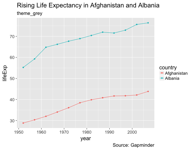
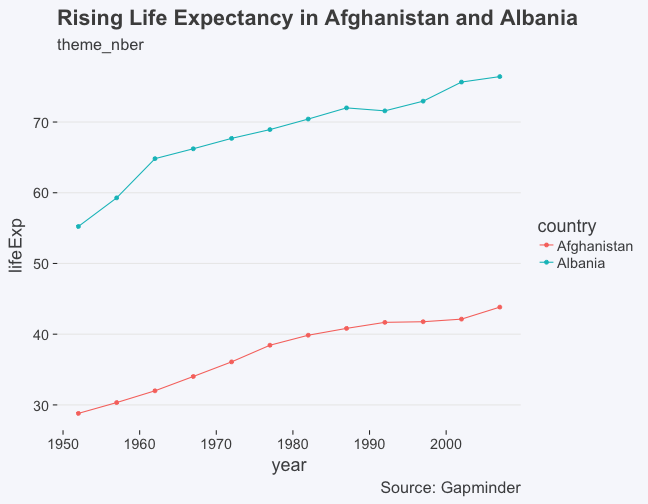
Here’s what it looks like compared to theme_grey, and how to use it.
library(gapminder)

p = gapminder %>% filter(country %in% c('Afghanistan', 'Albania')) %>%
  ggplot(aes(year, lifeExp, color = country)) +
  geom_point() + geom_line()

p + labs(title = "Rising Life Expectancy in Afghanistan and Albania",
       subtitle = "theme_grey",
       caption = "Source: Gapminder") +
  theme_grey(base_size = 18)
p + theme_nber(base_size = 18) +
  labs(title = "Rising Life Expectancy in Afghanistan and Albania",
       subtitle = "theme_nber",
       caption = "Source: Gapminder")
I haven’t replicated everything exactly. Compared to the NBER theme, I think the background is just a touch off. I don’t have an x-axis, and I have a y-axis label. The colors of the actual plots are also different. Instead of blue and red for Afghanistan and Albania, for instance, the NBER color palette would probably use variations of blue. That’s something I might look into in the future, as well as tweaking other defaults, although I feel like using only variations on blue/grey is a little limiting. But otherwise, I think it’s not too shabby for a first pass. Feel free to test it out for your own purposes and let me know if you have suggestions about the coding or design.
Leave a Comment